The crackle of fire and a sunset’s sigh,
October’s hush as the leaves drift by,
A whisper of spice, a flicker of flame,
The colors of longing that call you by name.
Burning through the clouds at sunset, red and orange have never been ones to whisper. These are hues that don’t simply dress a space but almost set it ablaze. They call to mind the warmth of flannel blankets on chilly nights, the rustle of maple leaves curling underfoot in the hush of fall, cinnamon on the stove, and the slow burn of embers after a fire has danced itself out.
Both in art and life, these hues have always known how to stir the soul. So, it’s no wonder red roman shades and orange window blinds have long anchored spaces that love a punch of energy, passion, and warmth. Whether used as bold, saturated statements or quieter, burnished accents, red and orange roman shades create depth, draw focus, and leave behind a low, lingering hum in the atmosphere.
However, the room for forethought is considerable when styling any room with these vibrant hues, as they may overwhelm the space if left untamed. And so, we bring you our top five tips to styling orange and red roman shades—insights reaped from years of experience and curated from design books. Take notes, make some decisions, and then finally, you’ll be all set to shop.
MORE FROM THE STORE: Red/ Orange Curtains | Pink/ Purple Curtains | Pink/ Purple Roman Shades
Use Pastel Tones of Red & Orange in Calm Zones
Think of spaces like bedrooms and nurseries as rooms where color learns to exhale. While true reds and vivid oranges carry the drama of a bonfire, their pastel cousins, like coral, blush terracotta, dusty peach, arrive with a gentler pulse. Therefore, dress these sleepy zones in less stimulating and saturated versions of red and orange.
Picture sunlight diffused through a sheer coral red-toned roman shade, warming the walls like the first blush of dawn. Or a peach orange roman shade framing the window, casting a warm, honeyed tint over linen sheets and a half-read book on the bedside. Pastel versions of orange and red roman shades bring the warmth without the wakefulness, ideal for spaces meant to soothe rather than stun. So, instead of raging orange, choose the salmon-toned Neutral Shadow, or the coral-toned Pollen for a room that is as lively as it is soothing.
Anchor these hues with grounding neutrals like grey, white, or beige, in other elements like the bedding, walls, and furniture, deliberately working to offset the subtle vibrance of the roman shades. And to build in cohesiveness, repeat your chosen shade of pastel orange or red in two or three accents: perhaps a terracotta lampshade, a rose-tinted throw, or cushions with papaya piping.
Then, take steps to make your orange/red roman shades bedroom-worthy. Ensure maximum light control to turn your bedscapes into sleep-friendly sanctuaries. Start by backing your red roman shades and orange window blinds with blackout lining. Opt for outside-mounted roman shades that engulf the window. Inside mounts, while neat, often leave slim gaps at the edges where daylight insists on sneaking through, which is hardly ideal for bedrooms. And voila, that’s how you dress a restful oasis with orange and red roman shades!
Use True Toned Reds & Oranges for High Activity Zones
In rooms where energy matters - home offices humming with ideas, playrooms that never quite settle, kitchens where hands and thoughts stay busy - red and orange roman shades truly earn their keep. These are window dressings with caffeine in their bloodstream, brilliant backdrops for sharpening focus, boosting alertness, and giving a space that subtle sense of forward motion.
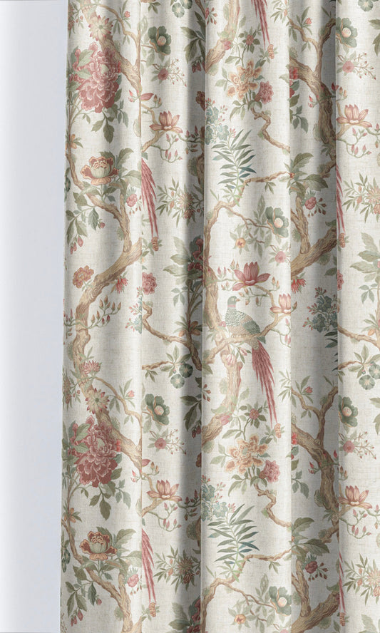
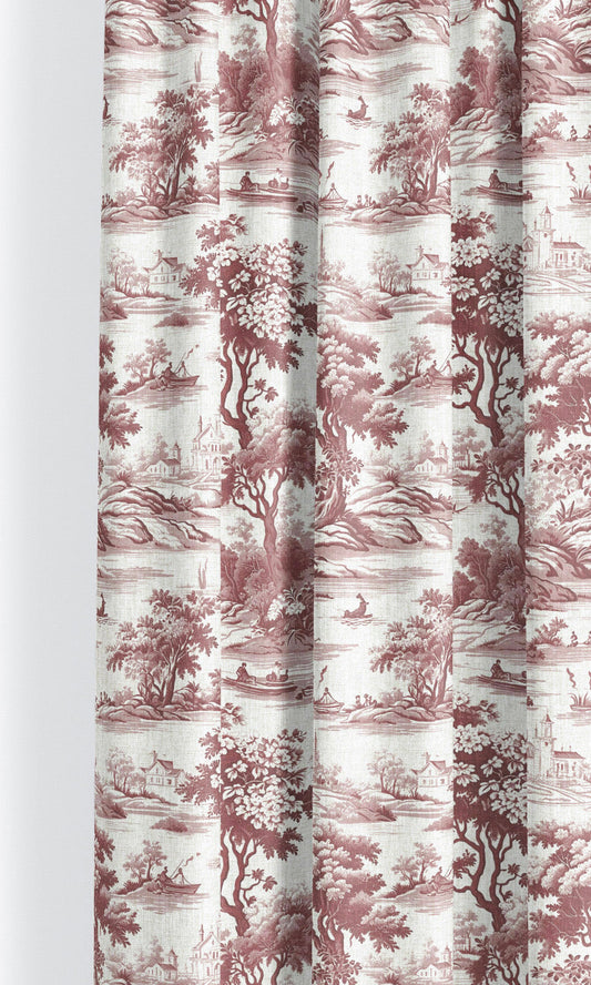
In a bold Victorian-inspired living room, consider a regal damask like Coburg Castle, all lit up with bright red and satiny beige like ruby-studded gold, making opulence a glaring statement, not a hesitant whisper under the breath. In an eclectic setting, likewise, consider a chinoiserie like Winter Flower, where vignettes of labor and amusement are arrayed on a spirited red, infusing Asian charm with its signature exuberance.
A gaming room or home office needs roman shades that color the walls with confidence and gusto. Think Berkshire, our bold abstract roman shade, or Ventus, our plain orange cotton roman shade, both charged with an infectious enthusiasm that offers a subliminal psychological push, nudging noob moments aside and easing deadline dread. While your roman shades alone won’t do the heavy lifting, they do set the room’s emotional tempo—and sometimes, that’s half the battle when it comes to performance. Consider it a pep talk in disguise—neatly folded and confidently hung!
Lean on Deeper/ Muted Shades of Red & Orange
Where brighter reds and oranges can feel high-spirited, their deeper, muted counterparts—burnt orange, brick, oxblood, embered rust, dried-apricot, roasted terracotta—carry a completely different temperament. These are grown-up versions of the palette: steadier, more grounded, and unmistakably authoritative. Designers reach for roman shades in these hues when they want warmth without whimsy, and drama without the slightest hint of juvenility.
So, in a living room that likes to welcome guests with a cozy visual hug, opt for deep orange roman shades like Barnafoss and Fervent Brass that instantly warm up a room. In the spectrum of red roman shades, you can look out for options like Lateefah and Mexican Chilli, equal parts charisma and suave. In rustic decor spaces, try out checkered beauties like Dash Curry or Solitaire Sheen. In country-style decor, florals like Ravali and Massicot would be a great match.
Use Fabrics that Feature Red/ Orange in Small Doses
Red and orange can easily overwhelm a space, so think of them the way good stylists do: as the scarf, the shoe, the lipstick, never the whole look (unless you mean it). If you’re not feeling the most confident in regulating the presence of these fiery hues, a simple workaround is to introduce them in measured, strategic doses. So, instead of committing to solid red/ orange roman shades, which can feel heavy-handed in quieter interiors, introduce the hue as an accent in your choice of fabric.
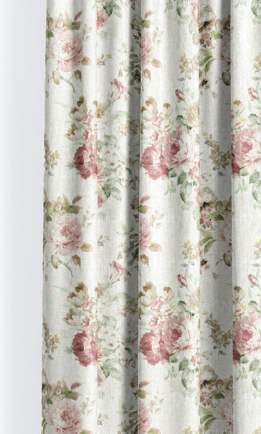
Choose fabrics so the color appears in bite-sized, visually digestible doses, in smaller or limited surface areas. This approach borrows from historic textiles and block-printed fabrics, where strong colors were rarely used edge to edge but allowed to dance across a neutral ground—rust threaded through oatmeal linen or a burnt terracotta shadow in an otherwise stone-colored weave. Take, for example, Cobblestone, which places red amidst gentle sage green and a calm cream backdrop. In such patterned fabrics, this contrast breaks the hue into intervals, making it easier on the eye and far more versatile across rooms.
Tune Intensity with Texture, Weave & Lustre
Red and orange roman shades are loud, but whether to intensify or muffle their sound is largely decided by the fabric’s finish. Lustre works as an amplifier, while texture serves as a silencer, and opacity does the job of a tuning knob. With the right choice of fabric, you can bring a touch of gentleness to the most audacious red, or, quite the other way, turn the faintest orange into a rolling fireball. These three aspects of a fabric choreograph this balance:
- Texture: How a color reads to the eye is to a great extent influenced by the fabric’s texture. Light falls evenly on a flat-woven fabric, intensifying its color; whereas on a coarse-textured fabric, the rays scatter, muting the tone’s vibrance. Take two fabrics from our collection for comparison that feature the same raspberry red. While Day Dream’s red feels saturated because of its flat weave, Natural Sound reads comparatively milder because of its linen texture.
- Lustre: When the resplendence of silk meets the vibrance of red/orange, the roman shade feels like a smoldering flame, as in Deep Eclipse. Put that same hue into Patina, and suddenly, it’s all candies and sugar highs. That about sums the difference between matte and gloss in fabrics.
- Opacity: Finally, look to the sheerness of the fabric or the lack of it as your final layer of control. Where a tight weave, like that of velvet, intensifies a tone, loose threading washes off the effect, as you can see in our Taffy Pull sheers, where a vibrant peachy orange softens into a dainty pastel, awash with daylight.
To sum it up, when choosing your red window blinds and orange roman shades, don’t just consider what tone to go for or what material composition to choose — see both aspects as one unit. If you’re going for a sheer, you can worry less about a vibrant red overpowering the room. Similarly, when you opt for a thick blackout, remember to choose a softer shade to compensate for the intensity that comes with the thick weave. Because how a red or orange reads to the eye finally depends on the chemistry between the texture, lustre, and opacity of the fabric.
To Sew It All Up
This edit is built on the idea that red and orange are not a single mood, but a spectrum. One that ranges from earthy and grounded to rich and expressive, depending on tone and texture. What matters is not how bold the color is, but how thoughtfully it’s chosen.
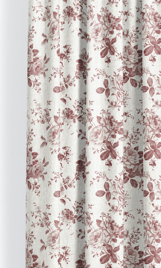
From rich terracottas and paprika reds to clay-washed corals and misty apricots, our orange and red roman shade collection is anything but one-note. Whether you're chasing a statement or craving a quiet glow, there's a fabric in this palette that speaks your language. So go ahead—step into the edit and let your space find its perfect shade of sunshine, spice, or sangria.

-
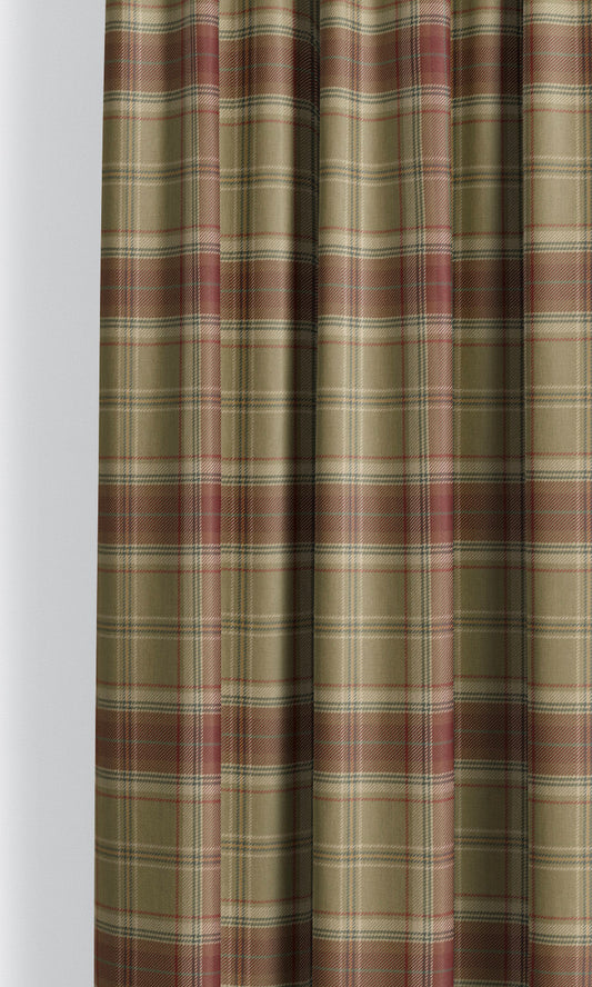
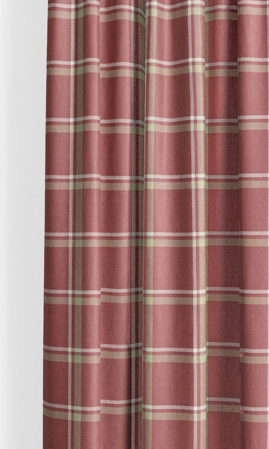
'Mystic Woods' Tartan Plaid Bespoke Fabric Blinds (Olive Green/ Maroon Red)
Price:
Regular price From $130.00Regular priceUnit price per -
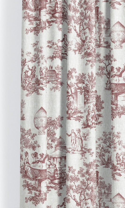
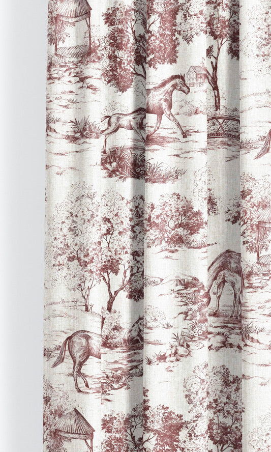
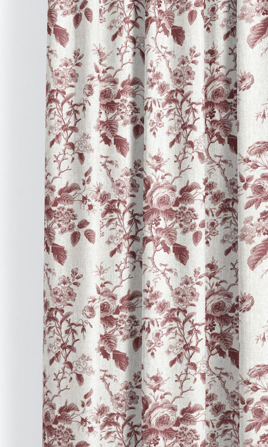
'Rose Flame' Toile de Jouy Custom Roman Shades (Maroon Red/ White)
Price:
Regular price From $130.00Regular priceUnit price per -
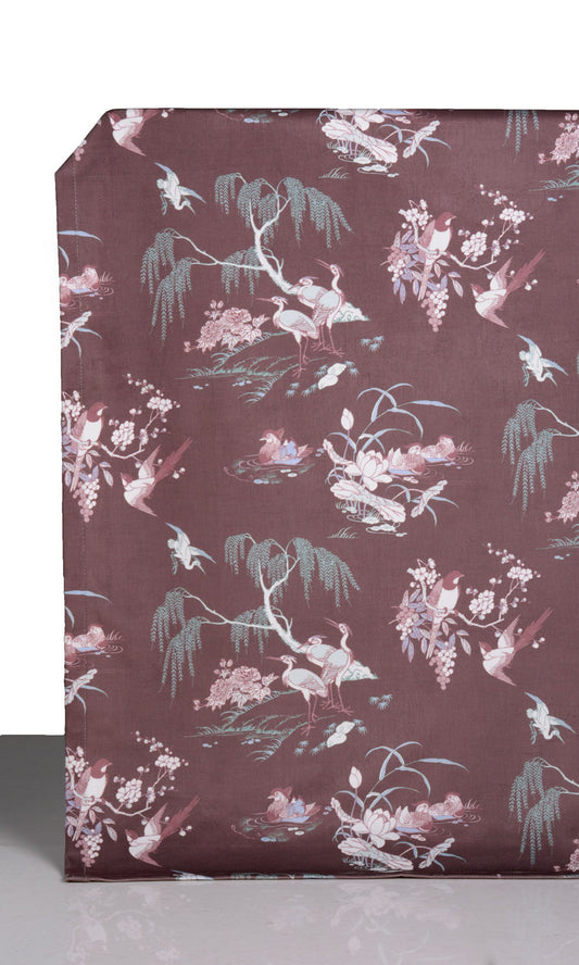
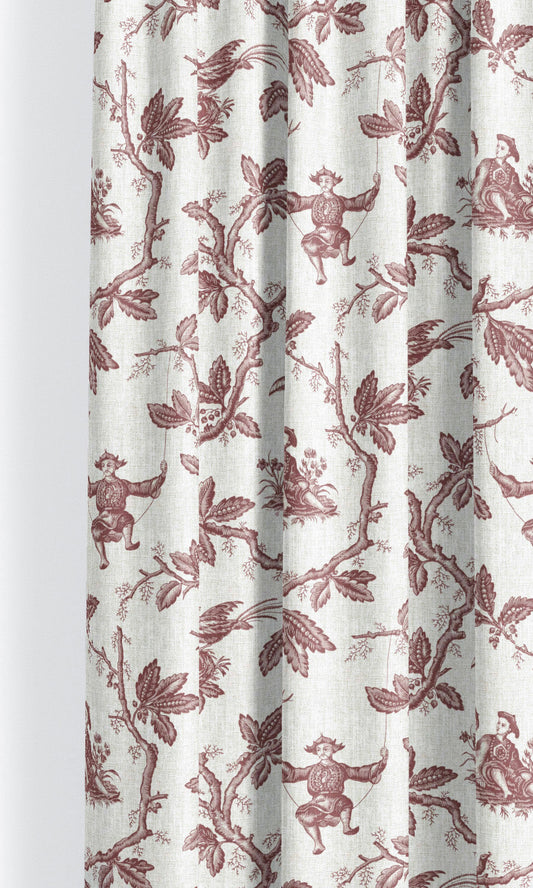
'Mahogany Warm' Chinoiserie Toile Velvet Custom Blinds (Burgundy Red)
Price:
Regular price From $123.00Regular priceUnit price per -
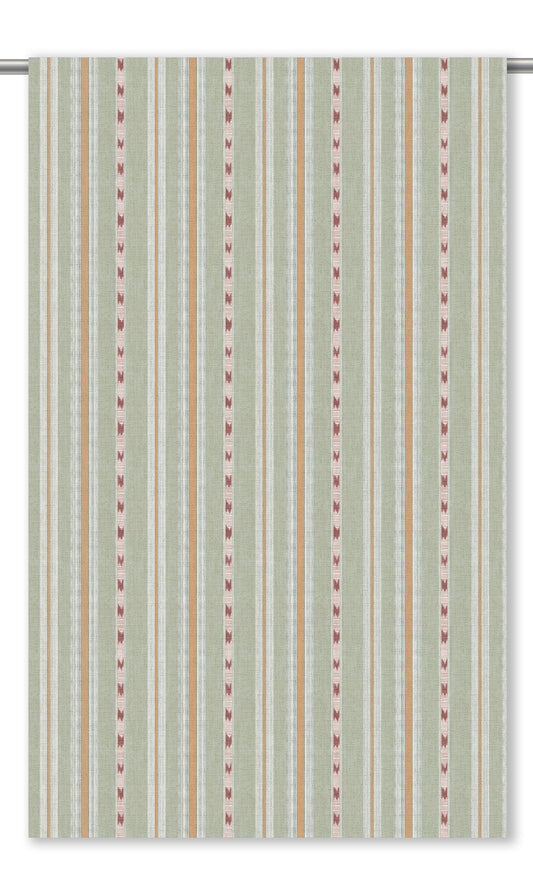
'Cascade' Modern Striped Made-to-Order Roman Shades (Red)
Price:
Regular price From $130.00Regular priceUnit price per -
'Castle Tower' Striped Custom Size Roman Shades (Soft Green/ Orange/ Brick Red)
Price:
Regular price From $130.00Regular priceUnit price per -
'Piano Keys' Chinoiserie/ French Floral Custom Roman Shades (Warm White/ Soft Maroon/ Sage Green)
Price:
Regular price From $130.00Regular priceUnit price per -
'Terracotta Oasis' Poppy Motif Floral Custom Roman Blinds (Ivory-Beige/ Deep Red)
Price:
Regular price From $130.00Regular priceUnit price per -
'Pebblebrook' Modern Striped Custom Size Blinds (Wine/ Coffee)
Price:
Regular price From $130.00Regular priceUnit price per -
'Red Cross' Tattersall Check Custom Roman Blinds (White/ Crimson/ Olive Green)
Price:
Regular price From $130.00Regular priceUnit price per -
'Burnt Peanut' Tattersall Check Custom Fabric Blinds (Brick Red/ Beige)
Price:
Regular price From $130.00Regular priceUnit price per -
'Blazing Ember' Windowpane Check Custom Size Roman Shades (Brick Red/ White)
Price:
Regular price From $130.00Regular priceUnit price per -
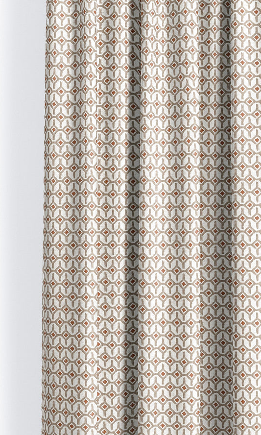
'Crunch Delight' Geometric Trellis Bespoke Window Shades (Taupe/ Crimson Red)
Price:
Regular price From $130.00Regular priceUnit price per -
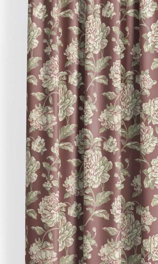
'Autumn Berret' Modern Floral Made-to-Measure Shades (Burgundy/ Cream/ Sage Green)
Price:
Regular price From $130.00Regular priceUnit price per -
'Timeless Charm' English Floral Custom Size Roman Shades (Pale Crimson/ Blush Pink/ Soft Green)
Price:
Regular price From $130.00Regular priceUnit price per -
'Flutter Pulse' Botanical Bespoke Window Shades (Beige/ Olive Green/ Red)
Price:
Regular price From $130.00Regular priceUnit price per -
'Bishnoi' Botanical Made-to-Measure Shades (Pale Beige/ Fern Green/ Brownish Red)
Price:
Regular price From $130.00Regular priceUnit price per -
'Piccadilly Berry' Toile de Jouy Custom Size Roman Shades (Maroon Red/ White)
Price:
Regular price From $130.00Regular priceUnit price per -
'Rosita Passion' Floral Toile Custom Fabric Blinds (Maroon Red/ White)
Price:
Regular price From $130.00Regular priceUnit price per -
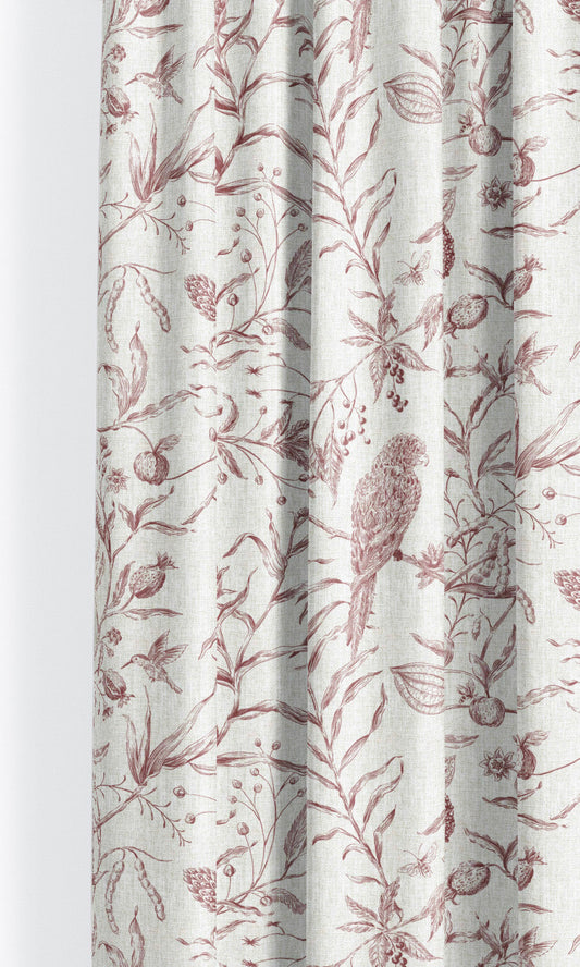
'Yoshimasa' Toile Damask Custom Roman Blinds (Maroon Red/ White)
Price:
Regular price From $130.00Regular priceUnit price per -
'Precious Flambe' Toile de Jouy Bespoke Fabric Blinds (Maroon Red/ White)
Price:
Regular price From $130.00Regular priceUnit price per -
'Hiroyuki' Floral Toile Custom Fabric Blinds (Maroon Red/ White)
Price:
Regular price From $130.00Regular priceUnit price per -
'Ayume' Floral Toile Custom Size Roman Shades (Maroon Red/ White)
Price:
Regular price From $130.00Regular priceUnit price per -
'Masakazu' Toile de Jouy Custom Roman Shades (Maroon Red/ White)
Price:
Regular price From $130.00Regular priceUnit price per -
'Antonio' Botanical Toile Custom Size Roman Shades (Maroon Red/ White)
Price:
Regular price From $130.00Regular priceUnit price per -
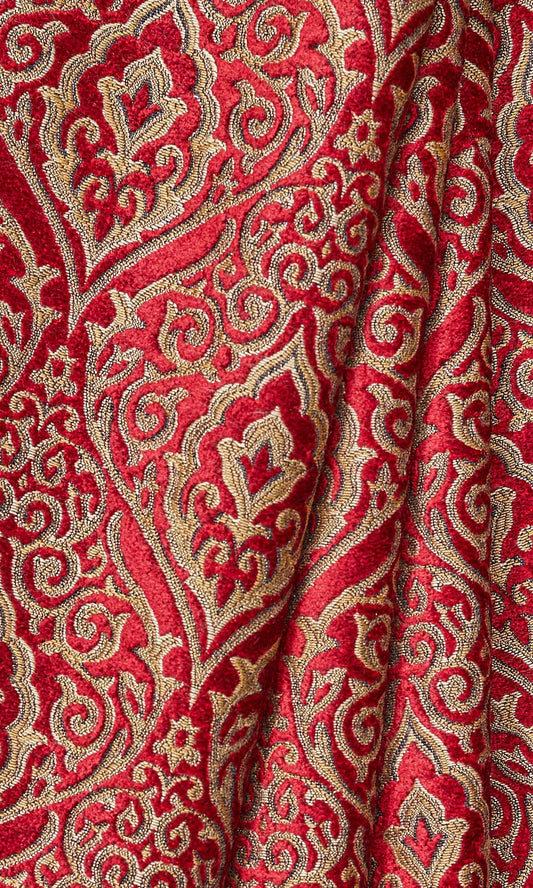
'Coburg Castle' Damask Velvet Made-to-Measure Blinds (Beige/ Brown/ Red)
Price:
Regular price From $134.00Regular priceUnit price per -
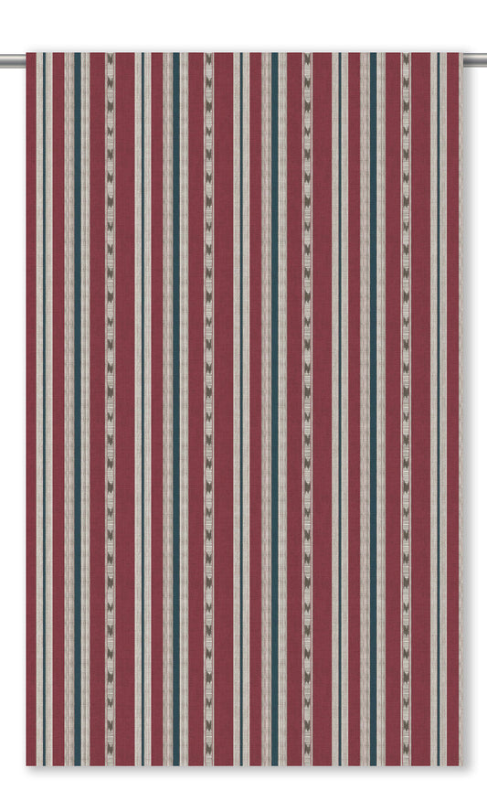
'Cockscomb' Striped Made-to-Measure Shades (Brick Red/ Indigo Blue)
Price:
Regular price From $130.00Regular priceUnit price per -
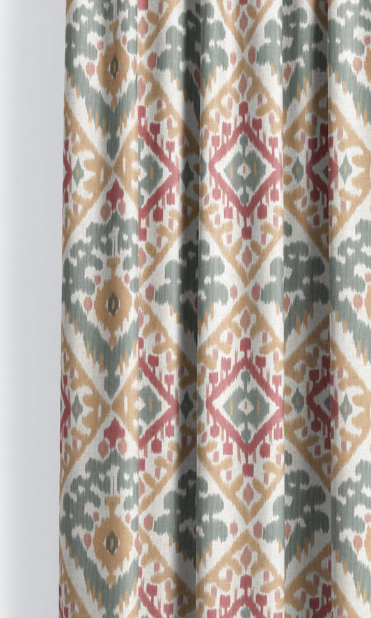
'Geraniums' Ikat Argyle Made-to-Measure Shades (Duck Egg Blue/ Peachy Beige/ Red)
Price:
Regular price From $130.00Regular priceUnit price per -
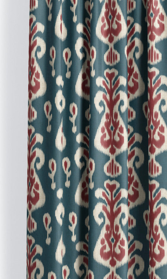
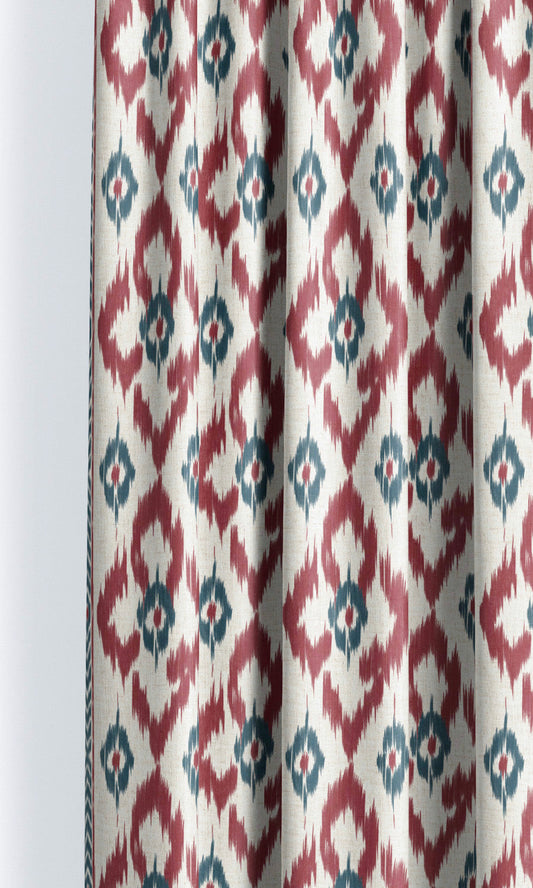
'Anchor Shade' Ikat Floral Made-to-Measure Shades (Prussian Blue/ Maroon Red)
Price:
Regular price From $130.00Regular priceUnit price per -
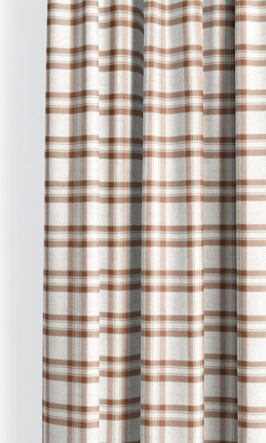
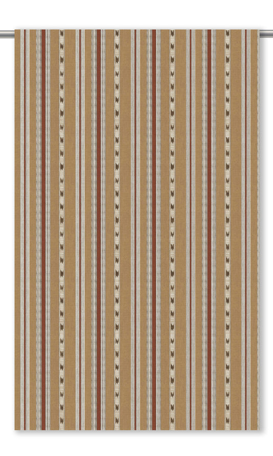
'Old Linen' Striped Custom Size Roman Shades (Tan Brown/ Maroon)
Price:
Regular price From $130.00Regular priceUnit price per -
'Foxy Magic' Ikat Geometric Custom Roman Shades (Maroon Red/ Indigo Blue)
Price:
Regular price From $130.00Regular priceUnit price per