A garden's grace and a twilight’s spell,
A secret shade where musings dwell.
Pink and purple have long lingered in the margins of poetry and paint, often typecast as soft, sweet, and sentimental. But look closer, and you'll find they’re quietly subversive. From the flushed cheek of first love to the hush of twilight, these hues hold entire emotional worlds in their spectrum.
A brush of rose can soften a minimalist space, while a sweep of plum can anchor a maximalist room with theatrical flair. These hues don’t just complement a room; they shift its mood entirely. But if you’ve ever approached these colors with a touch of nervousness, you’ll find roman shades to be your gentle, confidence-boosting cue. Unlike curtains that live in full view at all times, roman shades stack up, looking like valances in their folded form, offering your chosen pink or purple to serve as an accent at most time.
So, in celebration of colours that wear their heart on their sleeve (and look fantastic doing it), we present our extensive collection of pink roman shades and purple window fabric blinds. And while at it, our stylists introduce you to their favourite rooms to dress in pink and purple, stealing ideas from their fabric-fueled daydreams and slightly obsessive Pinterest boards. Come along!
MORE FROM THE STORE: Pink/ Purple Curtains | Red/ Orange Roman Shades | Red/ Orange Curtains
The Perfect Places for Purple Roman Shades & Pink Fabric Blinds
Pink settles into a nursery like the last blush of evening sky - soft and dreamy. Purple, rich and indulgent, gathers in the sculpted folds of a roman shade like the hem of a silk gown caught mid-curtsy. These hues aren’t just pretty; they’re atmospheric.
We love them most where they catch you by surprise; not only in a little girl’s nursery (though yes, we’ll get there), but in the unexpected corners of a home that crave softness, warmth, or a touch of unapologetic drama. In honour of such spaces, here are our favourite rooms and styling tips to treat as your design playground when dressing your windows with pink roman shades and purple fabric blinds.
The Boutique-Like Guest Bedroom
Let’s be honest: pink or purple roman shades don’t always make the cut in the master bedroom—not when you’re sharing it with someone whose design input includes words like “not too frilly.” But the guest room? That’s your perfect playground for these dainty hues. It’s the one space where no one gets a veto, and you can indulge all your rose-tinted dreams guilt-free.
Pink sheer relaxed fold roman shades paired with blackout curtains? Go for it. Lavender linen hanging on the windows? Absolutely. Layer up your pink or purple roman shades with cloud-soft bedsheets, a touch of brass, and a scented candle that makes your guests wonder if they’ve accidentally booked into a boutique B&B in Provence. (Fair warning: they might never leave!)
The Glam-Chic Living Room
If your living room’s been stuck in “sensible” mode—safe neutrals, polite proportions, nothing daring—it may be time to lift the mood with something truly decadent. So choose a fabric with presence: a hot pink velvet, a bold damask on violet, or a shimmering purple silk. When lowered, your roman shades will show the fabric in its full glory with the color, print and exact materiality. Stacked up, the same roman shade acts like a bespoke custom valance, a soft architectural crown that frames the window, while occupying less optical space.
In living rooms where the shades are often kept stacked up (hello, morning light, afternoon lounging, weekend reading), roman shades provide the perfect opportunity to choose a glam fabric in a bold tone of pink or purple, which you may otherwise hesitate to pick. So, you get to indulge in your color-obsessed dreams while the roman shade tempers it down by taking up less optical space when folded up.
Now, the alchemy that makes for a truly dramatic look for your glam chic living room. Choose a luxurious fold style. A relaxed roman shade with its soft, decadent swag at the bottom is perfect for that languid, couture-like nonchalance. Or, go for one of the classic flat fold roman shades in a heavy, luminous fabric to get crisp architecture with a glamorous sheen.
Add bespoke roman shade trimmings. Depending on the style of your roman shade and decor, opt for trimmings that speak the same language. For instance, in a modern home, opt for sleek ribbon trims. Or if you are looking for something more traditional, formal, and pairing with silks or velvets, tassel trims will prove to be strong candidates.
Keep the palette tight. Jewel tones, deep woods, gleaming metallics. Then add one wildcard (a sculptural lamp, perhaps?) and you’ll have yourself a living room that doesn’t just welcome guests—it wows them. Pink roman shades or purple window blinds, when styled with intention, give even the most reserved rooms a delicious hit of drama and old-world glamour.
The She-Boss’s Home Office
Elle Woods didn’t march into Harvard in hot pink for you to settle for grey walls and sad plastic blinds. Your home office is a sovereign state, your sanctuary of ambition. Here, you don’t need to tone anything down; not your ideas, not your flair, and certainly not your decor.
When you’re the boss, pink isn’t too pretty; it’s powerful. Purple isn’t too much; it’s magnetic. Choose a tone that reflects the way you work: a saturated plum or berry tone if your energy is Miranda Priestly-level composed and commanding, or a spirited pink if you believe in sparkle with strategy.
The trick is in the pairing. Ground bold tones with crisp whites, soft taupes, or natural wood. And definitely add texture with boucle chairs, feathery cushion covers, and if you’re going all in, layer your roman shades with custom drapes. Because if you're running the world one Zoom call at a time, your office should dress the part.
The Dreamy Nursery
Some say pink for girls is passe, but they must not have yet seen a baby gurgling under rose-hued canopy curtains at golden hour. Truth is, pinks will always reign in nurseries, not because we lack imagination, but because pink brings a gentle kind of joy no other color quite manages.
And here’s the twist: if you adore the softness of pink but not its saccharine sweetness, purple makes an irresistible stand-in. It carries the same feminine hush, just dressed in a slightly more mature and deeper shade.
Pink and purple both glow softly in morning light, soften shadows at sundown, and lend a poetic calm to even the most chaotic 3 a.m. diaper change. And when you mix in wisps of lilac or misty lavender, you get a palette that feels like a lullaby, not just to the baby, but to you, too.
Opt for blackout fabrics or blackout-lined roman shades to help regulate naps (yours and hers). Keep the palette grounded, layer the pink or lavender roman shades with cream or ivory custom curtains in sheer fabrics, and voila! You’ve got a nursery that’s as serene as it is storybook-worthy.
HomeSewn Wisdom: We provide cord anchors with all our roman shades so clients can secure the cord and keep it out of reach for a toddler or young kid. We strongly advise using these anchors so dangling cords can never become a dangerous sport for your kiddo. Beyond making the space safer for little ones, this small step also creates a cleaner, more polished finish.
The Meant-for-Royals Dining Room
A great dining room is one where the guests sit long after the meal has disappeared from the plates and the conversation lingers after dessert. And that sort of room doesn’t just conjure itself by accident but is coaxed into being by the ambiance. It has the kind of lingering warmth that doesn’t come from the menu alone, but the atmosphere people are wrapped in. The colours around the table dictate whether a room feels inviting or imposing, lively or languid. And that’s why your backdrop matters, and why purple, especially, earns its place in a formal dining room.
Start by considering the ambiance you want to create. Is it light and bright or formal and moody? For the latter, we suggest deeper tones like plum purple or amethyst in heavier velvets like Astral or resplendent silks like Royal Indigo. Trim your roman shades with ornate tassel or ribbon trims to add to the flair. But if your dining room is less Queen Anne and more Princess Diaries with a breezy aesthetic, we recommend the softer embrace of lilac tones. Start your search along the routes of Sweet Deal, Hampi, and Happy Hyacinth. Walk the extra mile and choose pom-pom trims or fringe trims for these light-hearted pink/ purple roman shades.
And here’s a stylist’s trick worth stealing: opt for European relaxed fold style roman shades. Their signature scallop at the bottom feels effortlessly luxe, as though your dining room has mastered nonchalant glamour. When privacy isn’t needed, keep your shades half-drawn at all times—just enough to let in the light while still showing off that graceful swag.
And then, friend, what do you get? A space that feels like a supper club or sunny lunch joint where toasts are longer, laughter louder, and every meal feels like a coronation.
Three Tips to Tie Up the Tale of Styling Purple & Pink Roman Shades
Before you dash off to dress every window in rose and regal hues, here’s a quick designer’s epilogue. We bring you a trio of tips to make your roman shades and space look like you just had a crash course in color psychology and design school:
TREAT PINK AS A NEUTRAL: Pink is now a staple rather than a statement, being used as a neutral in post-pandemic interiors that love a touch of lived-in peppiness and warmth. Blush, in particular, offers a new kind of optimism: more inviting than white, warmer than grey, and infinitely more fun than beige. It's a hue that flatters many palettes and punctuates your space with effortless charm. Our designers often launch a room’s palette with pale pink roman shades like Mix Candy or Luxury Traveler, then build around them using warm neutrals, wood accents, or snappy monochrome touches, creating a cocooning vibe that feels both intentional and spontaneous. Add a wink with accessories in brighter coral or magenta for unexpected pops of joy (hello, Barbie revival aesthetic!).
READ BETWEEN THE SPECTRUM OF PINK & PURPLE: When pink seems too peppy and purple too rich, reach for their softer kin - lilacs, lavenders and blushes. These tones bring a poetic calm to bedrooms and reading corners, balancing the romance of pink with the restraint of grey. And you can pair these beautifully with pearlescent walls, cane furniture, or matte black frames.
PLAY WITH NEIGHBOURS ON THE COLOR WHEEL: Pink and purple sit comfortably beside red, blue, and peach, their near-neighbours. Layering within that family keeps the room harmonious. Go for coral cushions with blush roman shades, or indigo ceramics with violet roman shades. It’s colour theory with a smile, minus the textbooks!
To Sew It All Up
In a world of trending tones and fleeting fads, pinks and purples have quietly held their ground. Pink can be powerful. Purple, regal and deeply grounding. They can read playful or poised, classic or bold, all depending on how you style them, where you place them, and what you pair them with. Sewn’s pink and purple roman shades collection is a love letter to this versatile color palette. So go ahead, indulge in the luxury that shopping with Sewn is! We await your order with our favorite rose-tinted glasses and royal needles.

-
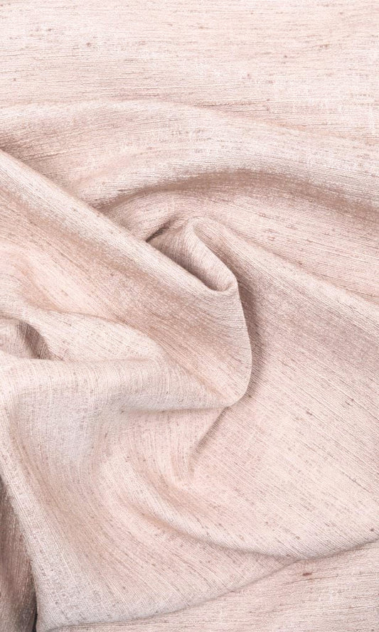
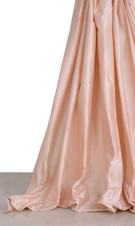
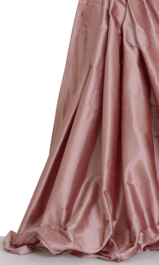
'Luxury Traveller' Silk Blend Made-to-Measure Shades (Pastel Pink)
Price:
Regular price From $123.00Regular priceUnit price per -
'Hampi Rocks' Silk Blend Made-to-Measure Shades (Pastel Pink)
Price:
Regular price From $123.00Regular priceUnit price per -
'Panama Rose' Blackout Custom Blinds (Raspberry Red / Wine Purple)
Price:
Regular price From $115.00Regular priceUnit price per -
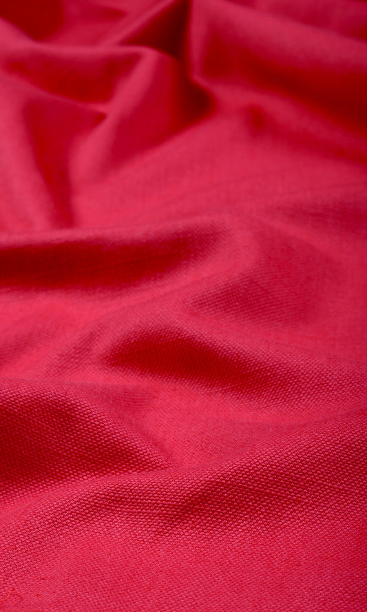
'Day Dream' Plain Made-to-Measure Roman Blinds (Raspberry Red)
Price:
Regular price From $126.00Regular priceUnit price per -
'Natural Sound' Linen-Blend Made-to-Measure Fabric Blinds (Red)
Price:
Regular price From $126.00Regular priceUnit price per -
'Narrow Creek' Cotton Blend Made-to-Measure Roman Shades (Pink)
Price:
Regular price From $126.00Regular priceUnit price per -
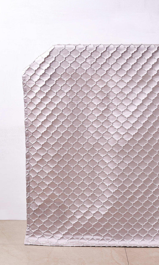
'Mineral Spring' Poly-Cotton Bespoke Roman Blinds (Fuchsia Pink/ Purple)
Price:
Regular price From $126.00Regular priceUnit price per -
'Cover Story' Linen-Blend Custom Size Shades (Watermelon Pink)
Price:
Regular price From $126.00Regular priceUnit price per -
'Spazio' Linen-Blend Made-to-Order Blinds (Lilac Purple)
Price:
Regular price From $126.00Regular priceUnit price per -
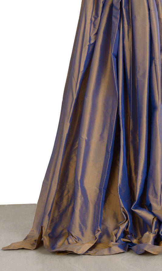
'Udyat' Shantung Silk Made-to-Measure Roman Shades (Grey/ Purple)
Price:
Regular price From $159.00Regular priceUnit price per -
'Ginto' Shantung Silk Custom Roman Shades (Blush Pink/ Red)
Price:
Regular price From $159.00Regular priceUnit price per -
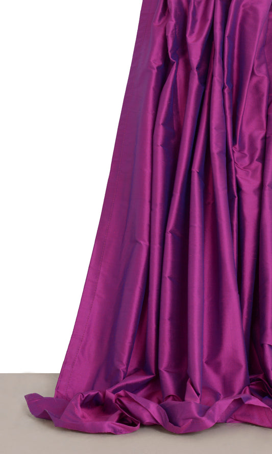
'English Rozsa' Shantung Silk Custom Blinds (Fuchsia Pink/ Purple)
Price:
Regular price From $159.00Regular priceUnit price per -
'Peach Farm' Shantung Silk Custom Roman Shades (Blush Pink/ Peach)
Price:
Regular price From $159.00Regular priceUnit price per -
'Deep Creek' Shantung Silk Custom Size Blinds (Brick Orange/ Red)
Price:
Regular price From $159.00Regular priceUnit price per -
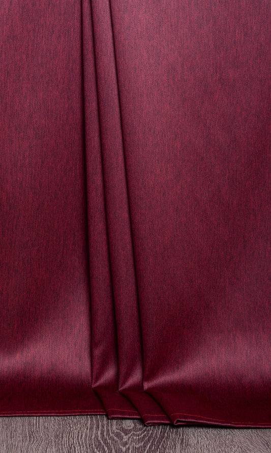
'Vine Veil' Shantung Silk Made-to-Order Roman Shades (Wine Purple)
Price:
Regular price From $159.00Regular priceUnit price per -
'Island Coral' Shantung Silk Made-to-Measure Roman Shades (Pink Punch)
Price:
Regular price From $159.00Regular priceUnit price per -
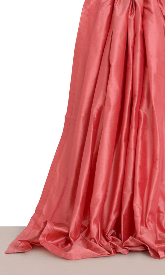
'Dunkel Rose' Shantung Silk Made-to-Measure Roman Blinds (Ruby Pink)
Price:
Regular price From $159.00Regular priceUnit price per -
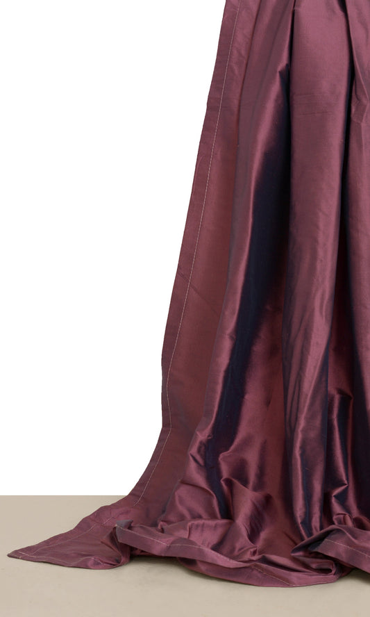
'Aslan' Shantung Silk Bespoke Roman Blinds (Wine Red/ Maroon)
Price:
Regular price From $159.00Regular priceUnit price per -
'Varnit' Shantung Silk Made-to-Measure Roman Blinds (Crimson Red)
Price:
Regular price From $159.00Regular priceUnit price per -
'Spice Tan' Shantung Silk Bespoke Roman Blinds (Cognac Red/ Brown)
Price:
Regular price From $159.00Regular priceUnit price per -
'Nina Rosa' Shantung Silk Made-to-Measure Roman Blinds (Pink)
Price:
Regular price From $159.00Regular priceUnit price per -
'Plum Star' Shantung Silk Custom Size Roman Shades (Purple/ Gold)
Price:
Regular price From $159.00Regular priceUnit price per -
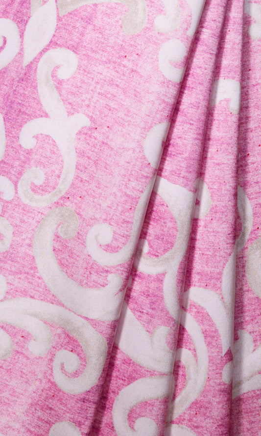
'Cold Roza' Damask Made-to-Measure Fabric Blinds (Pink/ White)
Price:
Regular price From $126.00Regular priceUnit price per -
'Speed Run' Floral Custom Size Blinds (Pink/ Blue/ White)
Price:
Regular price From $126.00Regular priceUnit price per -
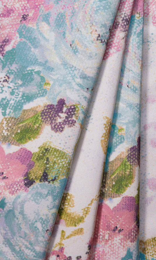
'Pangpar' Floral Window Shades (Pink/ Lilac/ Blue/ White)
Price:
Regular price From $126.00Regular priceUnit price per -
'Rosy Palace' Floral Window Shades (White/ Magenta/ Gray/ Green)
Price:
Regular price From $185.00Regular priceUnit price per -
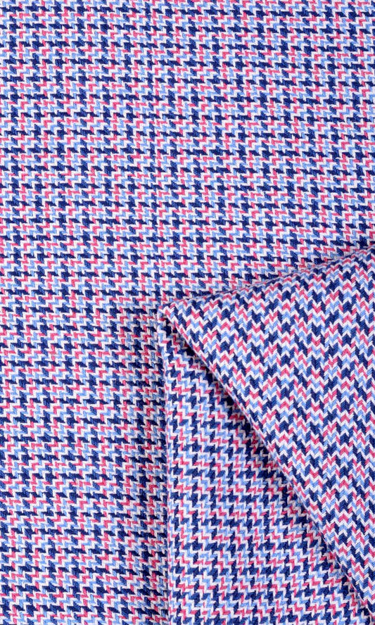
'Levent' Floral Window Shades (Purple/ Blue/ Green/ Gray)
Price:
Regular price From $123.00Regular priceUnit price per -
'Darfa' Floral Cotton Bespoke Blinds (Purple/ Blue/ Gray)
Price:
Regular price From $123.00Regular priceUnit price per -
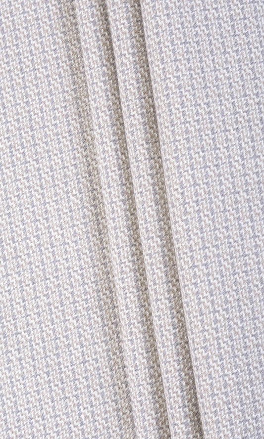
'Dove Fly' Textured Cotton Custom Roman Shades (Gray/ White)
Price:
Regular price From $129.00Regular priceUnit price per -
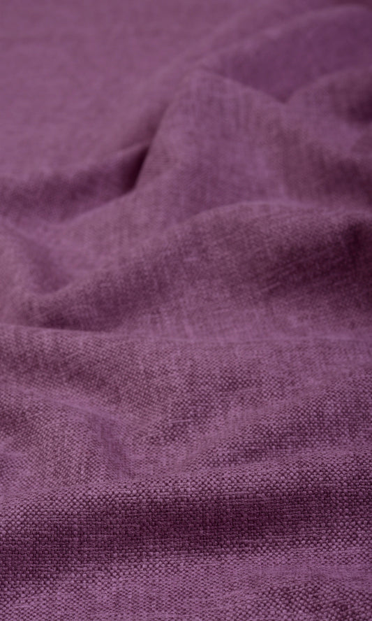
'Regal Crown' Basketweave Custom Blinds (Violet/ Purple/ Pink)
Price:
Regular price From $129.00Regular priceUnit price per