Since the first human carved a spiral into stone, the world has been patterned. The veins of a leaf, the swirls of a shell, everything we know came to us in rhythm and form, and we learned from these organic motifs. We wove them into textiles, painted them onto pottery, tiled them across palaces and cathedrals until patterns became our language of beauty.
And when you want to carry forward this story and drape it on your windows, stylists at Sewn show up at your door with a collection of over 1500 patterned & printed roman shades. And to help you craft the stage and choose the right patterned roman shade for your space, here are the top five styling tips from our pro stylists who have lived their entire lives playing with patterns:
MORE FROM THE STORE: Patterned/ Printed Curtains | Striped Roman Shades | Geometric Print Roman Shades
Employ Patterns as Tricksters in Making Your Space Look Taller/ Wider
Patterns are natural illusionists, little magicians that can optically re-scale a room without requiring a renovation plan. On roman shades, thoughtfully-chosen patterns perform their best acts quietly, turning short walls into lofty portals and narrow rooms into generous locales.
To lend height, turn to patterned roman shades with vertical motifs that act like visual stilts. Consider upward stripes, elongated botanicals, or linear geometrics pull the gaze upward, coaxing a low-ceiling room into standing a little taller. Mount the shade a few inches higher than the window frame so it draws the eye beyond the window’s edge, pulling a decorator’s sleight of hand that feels almost architectural.
If your aim is to widen or open up a narrow space, opt for horizontally travelling patterns. You can harness the power of horizontal stripes as seen in Corn Field, or other patterns that spread laterally across the shade, like Epic Banquet, to expand the width of the room visually.
The cleverest patterns don’t just decorate; they edit. They coax walls to take a few steps back optically, stretch ceilings upward, and turn the geometry of your home into a little work of theatre.
Pick a Pattern Per Your Style & Space
Every home has its own tempo. And patterns, like music, must find the right rhythm to play in tune. The bold chevron that looks electric in a mid-century living room might look misplaced in a rustic farmhouse breakfast nook. A toile that charms in a sunlit country cottage will be a misfit beneath the steel beams of a city loft. The secret lies in listening to your space before dressing its windows. What does it whisper? What kind of pattern would make it hum?
In stately rooms with chandeliers and heirloom furniture, time-honoured motifs like damask, arabesque, or chinoiserie add a sense of continuity, as if the fabric remembers a grander century. Modern apartments, on the other hand, look best in geometric prints like stripes, grids, or painterly abstracts that keep pace with their crisp lines and quiet restraint. For spaces that lean more lived-in, like cottages, garden rooms or sea-facing retreats, light-hearted patterns like gingham, ombres, or vines bring the comfort of nostalgia.
The goal isn’t to make your patterned roman shades the loudest voice in the room, but the one that harmonises. Choose a pattern that mirrors your architecture, flatters your decor, and most importantly, feels like it belongs to you.
Decide Between Design Layouts
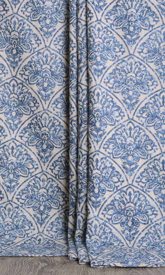
The layout of a pattern can be densely packed with minimal negative space between motifs, like in Ancient Ivory, or sparsely scattered with resting visual points between the motifs, as in fabrics like Palest Pistachio. Both these layouts have a unique visual presence and strike entirely different chords in the symphony of your rooms.
A dense all-over layout, where motifs are repeated closely across the fabric, creates an even spread. The eye sees the roman shade as a whole surface, so the impact comes more from the overall colour and theme than from individual motifs. A sparse, ‘floating-motif’ layout, on the other hand, leaves space between motifs. This open ground draws attention to each motif, making every scroll, stripe or medallion more noticeable.
Depending on their palette and scale, both layouts can feel too bustling or just right. Evaluate their suitability to your space in relation to the size of the room and the overall feel you are aiming for. But as a general rule, if you’d like individual motifs to steal the show, go for sparse, island-style pattern layouts. Conversely, if you’d like the pattern and the shade as a whole to be the star, put your trust in densely packed, all-over patterns.
HomeSewn Wisdom: The pattern’s layout should guide your choice of fold style, because each layout interacts with slatlines differently. Slats cutting across the shade tend to show more prominently on island-style motifs, interrupting their clean silhouettes and visual rhythm. All-over prints, on the other hand, mask the slatlines cleverly with their bustle. Therefore, we recommend the back-slatted and European relaxed styles that feature a continuous frontage for island-style, floating motifs. Comparatively, roman shades with all-over prints are versatile and are showcased well in virtually any fold style.
Mix Patterns in Your Decor
Whether your room already has patterns or you’re just beginning to layer them in, your patterned roman shades should be able to converse easily with other inhabitants of the room. If your space already includes patterned elements, like upholstery, rugs, wallpaper, or cushions, look for a roman shade motif that complements rather than competes with these patterns. For instance, florals sit comfortably alongside stripes because geometrics balance curvy, organic motifs. The contrast creates interest; the restraint keeps it harmonious.
Let the scale of motifs also be your guide. If the room already has a bold or large pattern in another element, a roman shade with a small-medium scale motif will help steady the room. If your current patterns are subtle or small-scale, a slightly more expressive shade can become the focal point. And lastly, don’t forget to bring in solids. Without visual breathers, no matter how strategically you choose your patterns, they can’t shine. More on this coming right up for you!
Pair Patterns with Solid Colors for Visual Balance
Patterns can do extraordinary things on a roman shade, but even the most striking motif needs the right conditions to land. Adding quieter counterparts, like plain walls, monochrome upholstery, or solid rugs, gives the pattern its depth, its contrast, its moment of clarity.
For that reason, we advise keeping the walls restrained when your windows carry the pattern story. Solid walls allow the shade’s colours and lines to sit forward, rather than dissolve into visual noise. And if wallpaper is non-negotiable, choose something with texture or an understated weave, something that supports the shade’s rhythm instead of challenging it. The aim is coherence, not a contest of motifs.
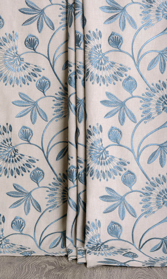
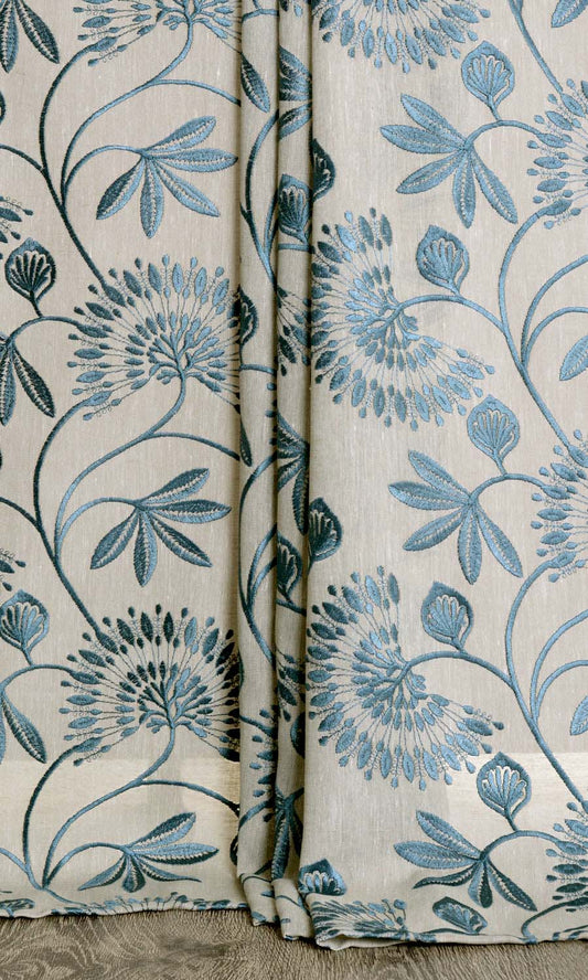
Layering works beautifully with roman shades as well. A patterned shade gains a tailored presence when paired with plain curtains that echo the accent tone from the pattern of the roman shade. These quiet layers act as visual brackets, framing the pattern, repeating key colors, and giving the shade a sense of architectural placement. A floral shade like Terrapin Green with green sprawling branches and vines, for example, will pair effortlessly with flanking panels in China Clay. The additions don’t distract; they refine.
To Sew It All Up
You fell in love, didn’t ya? So did we as we scourged the markets of the world to bring you a platter of exquisite patterned options to shop from. So, go right ahead, steal motifs from every corner of the world and nature with our 1500+ strong patterned roman shades collection. See you on the pattern-packed prettier side!

-
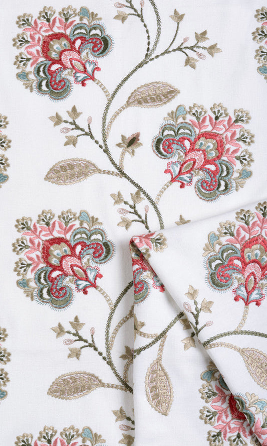
'Dragonfruit' Floral Embroidery Bespoke Window Blinds (White/ Red/ Pink)
Price:
Regular price From $158.00Regular priceUnit price per -
'Baby Bloom' Embroidered Made-to-Measure Shades (Green/ Blue/ White)
Price:
Regular price From $149.00Regular priceUnit price per -
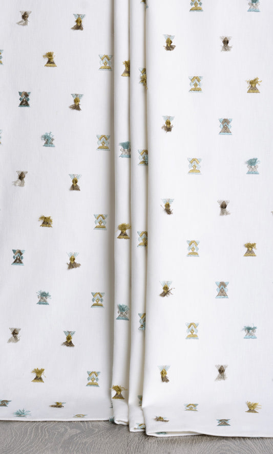
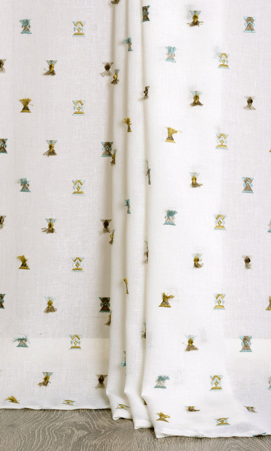
'Bee Little' Semi Sheer Custom Fabric Blinds (Teal/ Yellow/ White)
Price:
Regular price From $138.00Regular priceUnit price per -
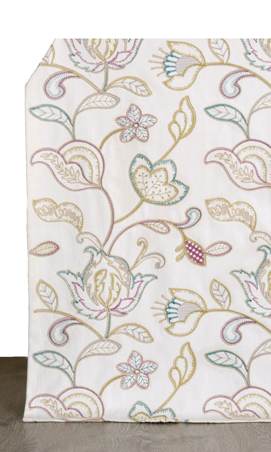
'Caracas' Vine Embroidered Custom Roman Shades (White/ Green/ Pink)
Price:
Regular price From $172.00Regular priceUnit price per -
'Pacific Bay' Embroidered Custom Size Roman Shades (Pale Beige/ Ink Blue)
Price:
Regular price From $158.00Regular priceUnit price per -
'Augustus' Vine Embroidered Bespoke Window Shades (Pale Beige/ Ocean Blue)
Price:
Regular price From $149.00Regular priceUnit price per -
'Precious Gem' Semi-Sheer Made-to-Measure Shades (Beige/ Teal)
Price:
Regular price From $138.00Regular priceUnit price per -
'Winter Chill' Floral Embroidery Custom Roman Blinds (Blue/ White)
Price:
Regular price From $172.00Regular priceUnit price per