The story of geometry in interiors begins far before modern interior design. The ancient Greeks lined their temples with meanders and key patterns, and Islamic builders transformed geometry into transcendence with girih patterns in stone and jali screens. Over centuries, geometry has reshaped itself through the lens of art and design. Art Deco reveled in bold symmetries, its interiors glittering with chevrons, zigzags, and radiant sunbursts. The Bauhaus and De Stijl translated lines, grids, and blocks of color seamlessly onto textiles and interiors. By mid-century, geometrics filled wallpapers and upholstery with atomic starbursts and kaleidoscopic prints, while the Pop Art of the 1960s and ‘70s turned living rooms into optical experiments alive with pulsating checks and vibrating stripes.
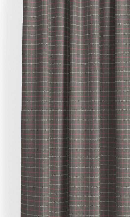
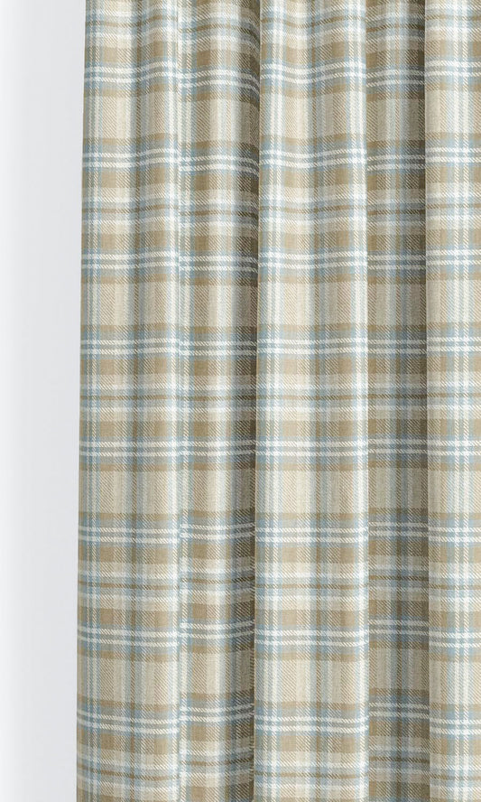
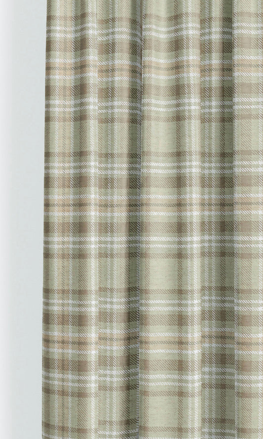
Today, when geometric print roman shades adorn a window, they bring this entire lineage into a room. A tartan roman shade channels the rugged poetry of the Scottish Highlands, a lattice-printed blind recalls Moorish courtyards, a striped window dressing echoes Bauhaus clarity, while a tessellated repeat whispers of ancient mosaics beneath the Mediterranean sun.
These patterns endure because they are universal, found in both history and nature, and roman shades bring the best out of them. Shades are smart, stylish, and just a little bit smug about how effortlessly they can pull a room together. Every fold knows what it’s doing, and how beautifully it’s doing so.
Geometric patterned roman shades make order feel like art, symmetry feel like style, and somehow turn simple fabric into something a bit… well, irresistible. Proof, if ever you needed it, that mathematics can, in fact, be rather good-looking.
If you’ve found us today while seeking your own little piece of good-looking geometry, welcome! But before you dash off to fill your shopping cart, let our stylists serve you a few tips and ideas, straight from their notepads and Pinterest pilgrimages. Come along!
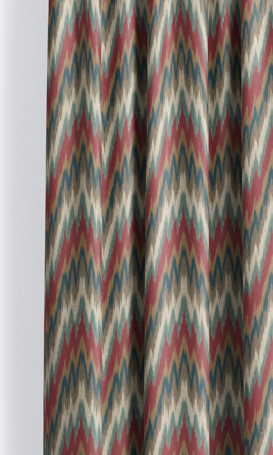
MORE FROM THE STORE: Geometric Print Curtains | Checkered Roman Shades | Striped Roman Shades
Select Scale in Tandem with Space
If you think of geometric roman shades as outfits for your window, the scale determines whether it looks perfectly tailored or borrowed from someone else’s wardrobe. And ensuring it doesn’t fall into the latter category is simple if you go by two simple guidelines:
-
Take into consideration the size of the window and the room. Small space? Petite window? Don’t let a large-scale plaid muscle its way in. Modest settings thrive on small-scale patterns like delicate ginghams, candy stripes, or petite diamonds floating across your roman shade. But in a grander space, those modest motifs can disappear faster than small talk. That’s where large-scale geometry earns its moment: bold, expansive, and perfectly proportioned to make a statement without overwhelming the eye.
-
Then there’s the style question every fabric secretly asks: do you want me to blend in or be the star of the show? If you want your geometric roman shades to be the focal point of your decor, pick a large-scale geo-print like an awning stripe or a bold plaid. Such patterns command attention. On the other hand, if your heart leans towards subtlety and you’d rather have your geometric roman shades sit quietly in the background, choose smaller patterns that work their charm with restraint, adding beauty without stealing the scene.
While scale is a key factor in helping your geometric print shade feel at home, it is not the sole player. The palette is just as important, and that brings us to our next styling recommendation.
Pick Your Palette in Tandem with Your Decor Goal
Your palette should work hand in hand with your scale in making your roman shades the lead singer or the harmoniser in the melody of your decor. You are the orchestrator, and here’s how to decide the right role and chords for your piece:
If you’d like your roman shades to be the center of attention, let the palette be as striking as your scale and look out for well-defined silhouettes rather than blurred out finishes, like Blueberry Basket's bold contrast of inky blue and white, Blenheim Vista’s riveting combination of burgundy and forest green, or Custard Apple's bright orange and Acorn Shell's eye-catching silver-lined red.
Quite the contrary, if you want your geometric print to be more soft-spoken despite the bold scale, look out for softer tones and subtler contrasts. Take the case of Riviera Maya whose generously scaled awning stripes are more inclined to recede into the backdrop thanks to their low-contrast, neutral palette.
Besides the colors themselves, the finish of the print is another aspect that can notch its energy up or down. Consider how Hidden Opossum that shares Blueberry Basket’s pattern and palette is comparatively less attention-seeking due to its faded finish.
To sum it up, palette and scale work in tandem, so make your choice by considering how the pattern works as a whole to either draw the eye or blend into the space.
Make Pattern the Mouthpiece of Your Decor Style
As geometric shapes traveled through time and home interiors, they picked up accents, each cultural era shaping geometry in its own dialect of design. And today, those same shapes still help us say something about who we are through the decor of the rooms we live in.
An ikat stripe like Limelight Cream feels like summer in Santa Fe; sun-warmed, worldly, and a little bohemian. It’s the perfect match for eclectic interiors that thrive on character and collected charm. A starburst or sunray motif on a roman shade, like Pacific Fog, channels mid-century glamour, the kind that belongs in a Palm Springs living room with a martini on the side table. And nothing comes close to a charming gingham print like Castilian, in anchoring a country-style home in a lived-in, rustic beauty.
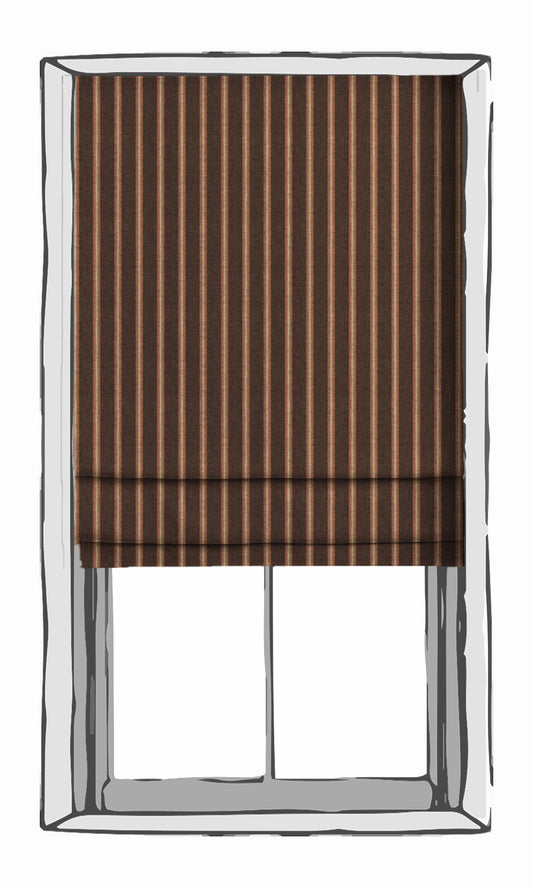
Stripes and checks? Eternal classics. Our geometric roman shades, like Gasteria, Batiste, and Nodding Gray, feel just as at home in a Nantucket beach house as they do in a tailored, East Coast study.
At the end of the day, whether your geometric roman shade hums in harmony with the room or belts the solo, the pattern you pick becomes the voice your décor speaks in—clear, confident, and unmistakably yours.
Be Wise with the Fold Style You Pick
Be strategic with your fold style choice. And in the case of medium-large scaled geometric-patterned roman shades, the back-slatted flat fold style is the clear winner. Its frontage stays clean and seamless, letting your geometric motifs shine without interruptions. For rooms that call for a softer touch, the European relaxed style fold brings just the right amount of charm. The gentle scallop along the bottom feels graceful and soft, pairing perfectly with lighter geometrics or fluid prints.
Now, a word to the wise: approach front-slatted plain fold style with a bit of caution when working with certain patterns like horizontal stripes and plaids. The perfectly straight, raised silhouettes of the slats in this style can highlight even the smallest tilt or wave in the print. On a back-slatted or relaxed shade, those little asymmetries disappear, but pitched against the visible slats of the front slatted style, every little tilt of a horizontal stripe wants to make its presence known.
Pair with Other Patterns
Pattern mixing is a bit like hosting a dinner party. Everyone can get along if you seat them wisely. Moroccan tessellations can dance beside florals, heritage tartans can graciously wrap around painterly abstracts, and country stripes and ditsies get immersed in conversation like old pals. Because really, pattern play is about chemistry more than caution.
The secret lies in contrast and companionship. Straight lines and sharp angles find balance when placed alongside something softer, like an airy botanical, a watercolor swirl, or a curvy paisley. Scale matters too; if your shades flaunt a bold, large-scale print, let nearby patterns whisper in smaller voices. When the geometry is fine and detailed, that’s when you can afford to let the rug’s pattern roar a little louder.
Color, of course, is the peacemaker. A single hue repeated across prints and patterns keeps the room feeling thoughtful rather than theatrical. And between all that pattern and polish, give the eye a little rest—an expanse of solid fabric, a plain wall, a solid colored sofa—so your prints have room to breathe.
To Sew It All Up
After travelling through lines and angles, curves and twirls, we are finally at the end of this shapetastic journey! We can see you smiling, thinking of that one print that has already caught your eye. So, go right ahead, fill your cart to your heart’s liking, and find the match made in our ‘spools paradise’ for your windows.

-
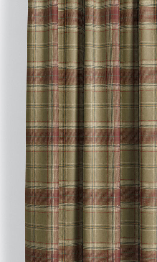
'Mystic Woods' Tartan Plaid Bespoke Fabric Blinds (Olive Green/ Maroon Red)
Price:
Regular price From $130.00Regular priceUnit price per -
'Dreamy Cane' Checkered Custom Roman Shades (Linen White/ Pale Brown)
Price:
Regular price From $130.00Regular priceUnit price per -
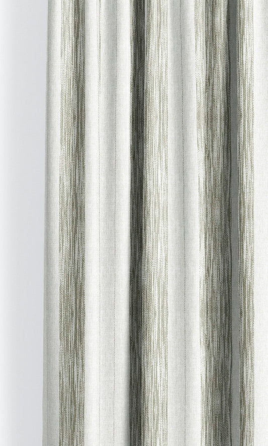
'Moss Print' Faded-Effect Awning Stripes Custom Size Roman Shades (Moss Green/ White)
Price:
Regular price From $130.00Regular priceUnit price per -
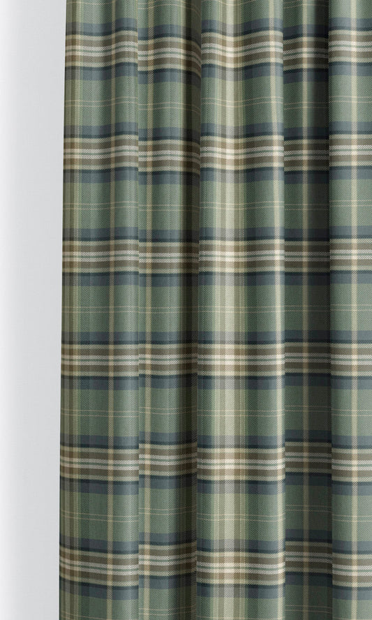
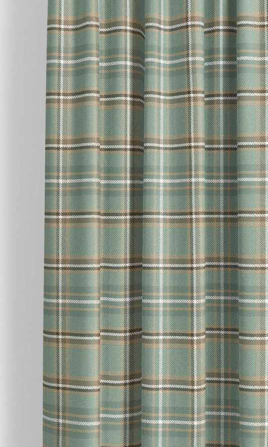
'Garden Paradise' Tartan Plaid Made-to-Measure Shades (Teal Green/ Navy Blue)
Price:
Regular price From $130.00Regular priceUnit price per -
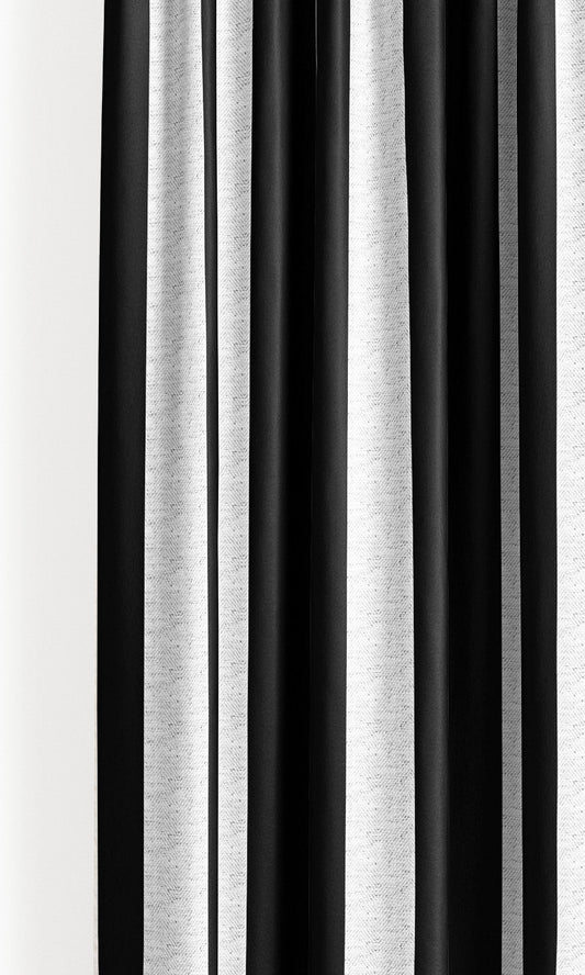
'Stark Beauty' Awning Striped Custom Roman Shades (Black/ White)
Price:
Regular price From $130.00Regular priceUnit price per -
'Magnolia Stroll' Plaid Velvet Made-to-Measure Shades (Seafoam Green/ Olive Brown/ Beige)
Price:
Regular price From $130.00Regular priceUnit price per -
'Zero Gravity' Rattan Striped Custom Roman Shades (Navy Blue/ White)
Price:
Regular price From $130.00Regular priceUnit price per -
'Breaker Bay' Floral Lattice Print Bespoke Fabric Blinds (Navy Blue/ White)
Price:
Regular price From $130.00Regular priceUnit price per -
'Cascade' Modern Striped Made-to-Order Roman Shades (Red)
Price:
Regular price From $130.00Regular priceUnit price per -
'Italian Dolce' Striped Custom Roman Shades (Warm Grey/ Beige)
Price:
Regular price From $130.00Regular priceUnit price per -
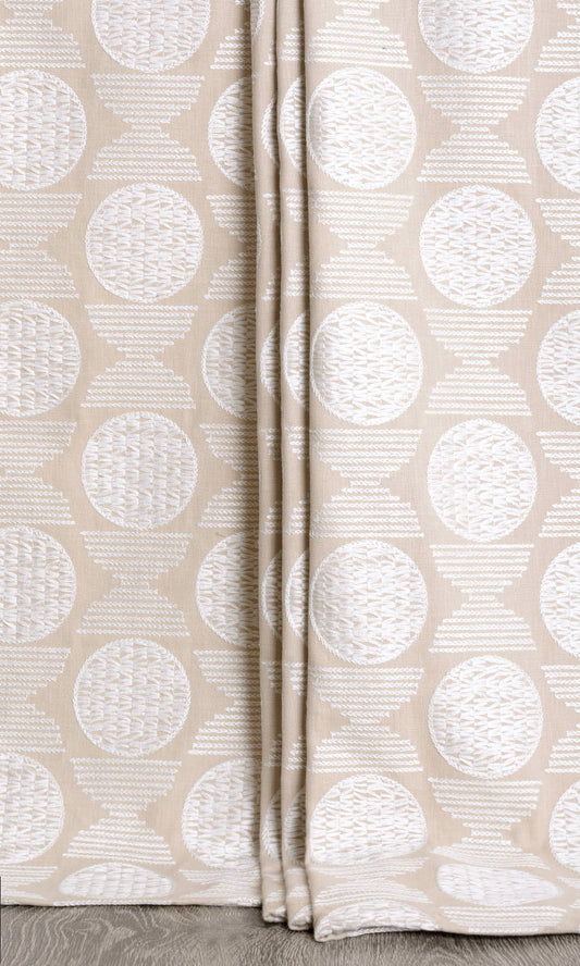
'Sugared Tint' Geometric Patterned Bespoke Shades (Beige/ White)
Price:
Regular price From $142.00Regular priceUnit price per -
'Castle Tower' Striped Custom Size Roman Shades (Soft Green/ Orange/ Brick Red)
Price:
Regular price From $130.00Regular priceUnit price per -
'Aurea' Grainsack Striped Custom Fabric Blinds (Wheat Beige/ Milky White)
Price:
Regular price From $130.00Regular priceUnit price per -
'Chambourd' Tattersall Check Velvet Custom Roman Blinds (Charcoal Gray/ Pink/ White)
Price:
Regular price From $130.00Regular priceUnit price per -
'Tyler' Plaid Custom Roman Shades (Powder Blue/ Beige)
Price:
Regular price From $130.00Regular priceUnit price per -
'Magic Lantern' Plaid Custom Size Roman Shades (Sage Green/ Brown)
Price:
Regular price From $130.00Regular priceUnit price per -
'Birch Meadow' Small Geo-Print Custom Size Roman Shades (Peanut Brown/ White)
Price:
Regular price From $130.00Regular priceUnit price per -
'Pebblebrook' Modern Striped Custom Size Blinds (Wine/ Coffee)
Price:
Regular price From $130.00Regular priceUnit price per -
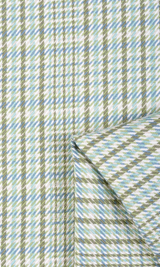
'Crystal Reef' Houndstooth Cotton Custom Blinds (Green/ Blue)
Price:
Regular price From $129.00Regular priceUnit price per -
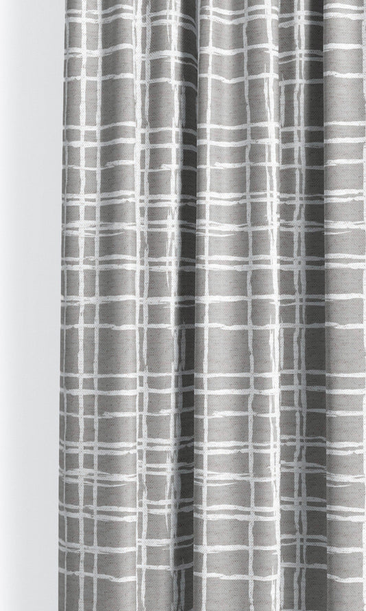
'Gray Blush' Abstract Grid/ Checkered Print Custom Roman Blinds (Soft Gray/ White)
Price:
Regular price From $130.00Regular priceUnit price per -
'Cromwell Brown' Candy Striped Custom Size Roman Shades (Olive Brown/ White)
Price:
Regular price From $130.00Regular priceUnit price per -
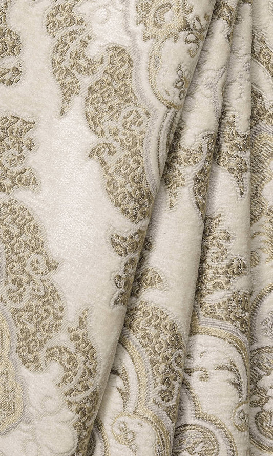
'Canary Lane' Damask Velvet Bespoke Blinds (White/ Beige/ Brown)
Price:
Regular price From $134.00Regular priceUnit price per -
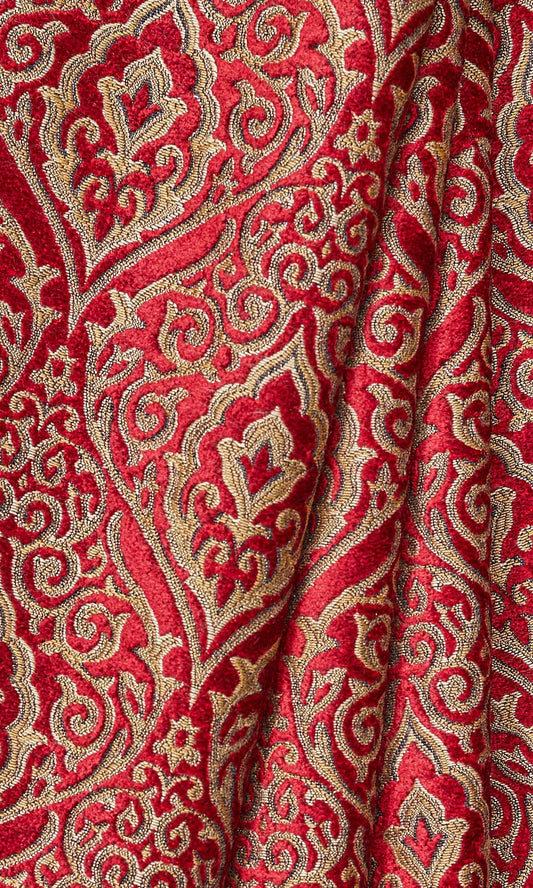
'Coburg Castle' Damask Velvet Made-to-Measure Blinds (Beige/ Brown/ Red)
Price:
Regular price From $134.00Regular priceUnit price per -
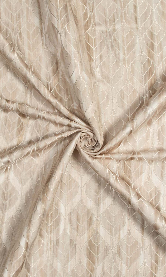
'Perfumed Powder' Petal Patterned Window Shades (Pale Beige/Brown)
Price:
Regular price From $126.00Regular priceUnit price per -
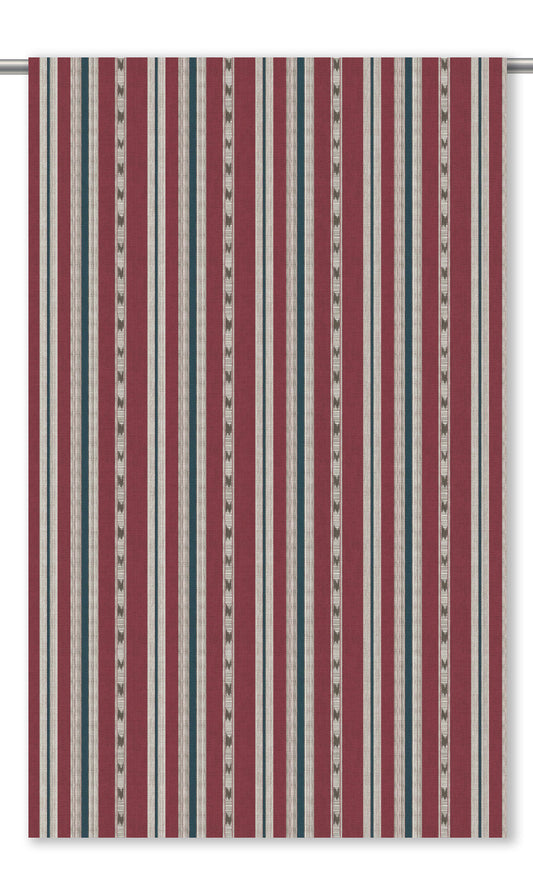
'Cockscomb' Striped Made-to-Measure Shades (Brick Red/ Indigo Blue)
Price:
Regular price From $130.00Regular priceUnit price per -
'Geraniums' Ikat Argyle Made-to-Measure Shades (Duck Egg Blue/ Peachy Beige/ Red)
Price:
Regular price From $130.00Regular priceUnit price per -
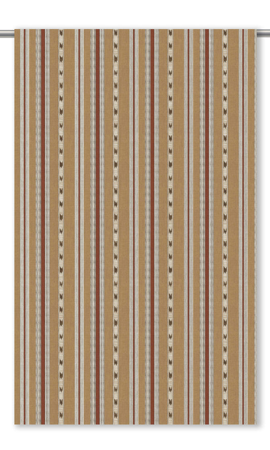
'Old Linen' Striped Custom Size Roman Shades (Tan Brown/ Maroon)
Price:
Regular price From $130.00Regular priceUnit price per -
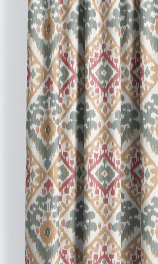
'Foxy Magic' Ikat Geometric Custom Roman Shades (Maroon Red/ Indigo Blue)
Price:
Regular price From $130.00Regular priceUnit price per -
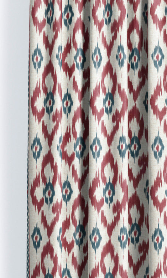
'Angel Landing' Ikat Argyle Custom Size Window Shades (Maroon Red/ Indigo Blue)
Price:
Regular price From $130.00Regular priceUnit price per -
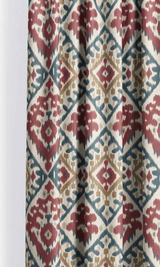
'Rock Tree' Ikat Chevron Custom Roman Shades (Red/ Blue/ White)
Price:
Regular price From $130.00Regular priceUnit price per